Text and images are the fundamental elements that make up graphic design or visual communication. Copywriting and typography are two important disciplines that determine the communication value of textual elements on your visual piece.
Copywriting is the art and science of writing copy, using words to convey your marketing message that sells your service or product. Good copywriting convinces prospects to heed your call-to-action. Copywriting is focused on the content of your message. It betters what you say and how you say things. Typography is the art and technique of arranging type to make written language legible, readable and appealing. It strengthens and improves visual communication by using appropriate typefaces, manipulating point sizes, kerning, leading, etc.
Typography can make or break your design. If you are a young graphic designer, here are some tips on how you can better design with typography!
1. Typeface Sets the Mood of a Design
In typography, a typeface is a set of one or more fonts that shares common design features. Choosing an appropriate design can set the mood for your design. Serif typefaces are mostly associated with mood and feeling like classic, elegant, formal, confident and established. Sans Serif typefaces are considered modern, direct and precise. Of course, in the present day, we are blessed with more than these two genre of typefaces. Decorative fonts are a plenty and they each come with their unique design, persona and sets a distinctive mood for your design.
2. Font Size Determines Information Hierarchy
The font size determines information hierarchy and sets the visual path for the audience. A good graphic designer can strategically guide the audience through his or her visual communication piece by setting focal points. A larger font size demands more attention and warrants the gaze of the audience. A smaller font size makes the text less significant. On top of giving textual hierarchy to a visual piece, the variance of font sizes also break the monotonous mood exhibited by a block of text with the same font size.
3. Kerning Influences Legibility of Text
Kerning is the spacing between characters in a piece of text. Modest kerning improves the readability of words. Generous kerning is good on a headline or a single word (e.g. brand name). It exhibits sophistication. On the contrary, generous kerning on the main text may hinder readability. Text with little or negative kerning causes distress and can be ideal on headlines where that is the intended impression to be made on the audience.
4. Leading Influences Legibility
In typography, leading is the amount of space between lines of text. Leading can be increased to improve the readability of textual contents. Modest leading associates different lines of text. Excessive leading uncouples and separates lines of text.
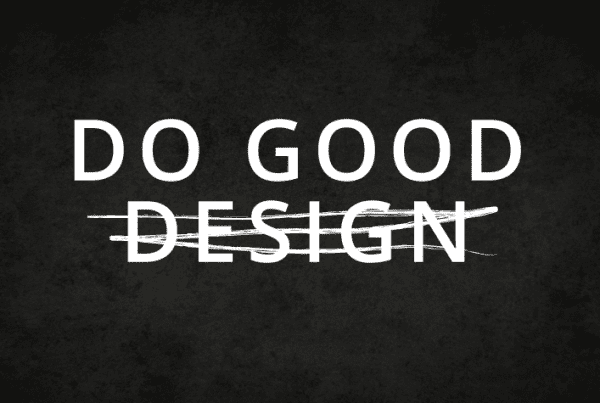
Some design rules are meant to be broken. The same applies to typography conventions. Creativity takes courage and requires boldness to violate the known rules. However, it is important to know the rules before breaking them! The next time when you design something, do consider how you can better design with typography!