A Profound Word
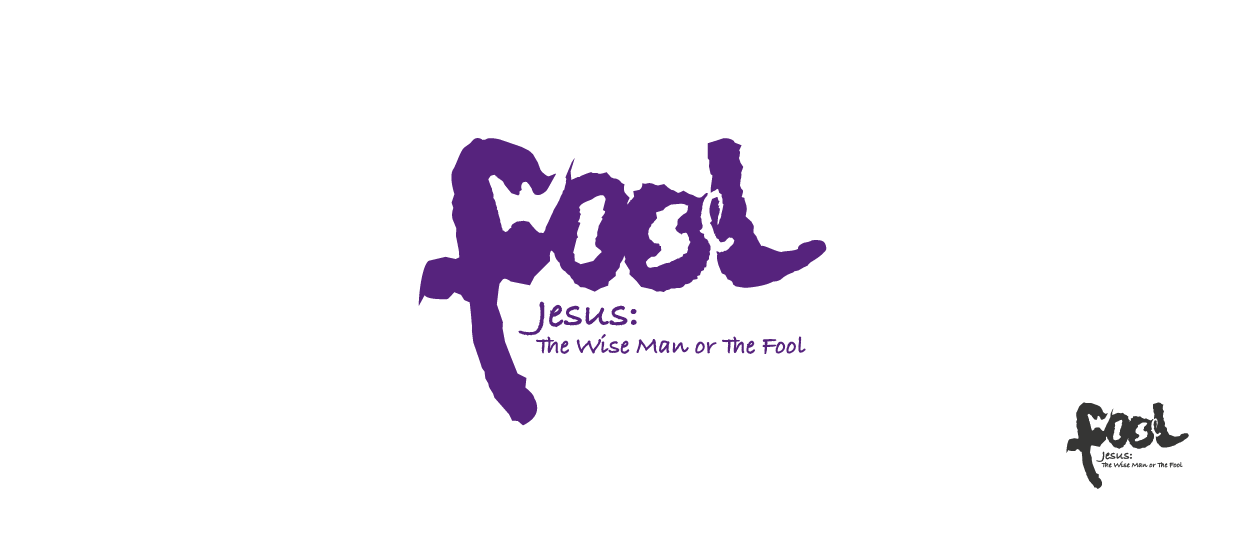
The event logo design is made by delicate handling of positive and negative spaces. The emblem teases the eyes of a reader. When one sets their eyes on the positive space, they read the word ‘fool’; when their gaze is on the negative space, they make out the word ‘wise.’ Such was the intention behind the emblem; we had wanted to arouse curiosity; we had desired a mark that one could ruminate on.


