Croissant Confluence: ARA Bakehouse’s Symbolic Logo
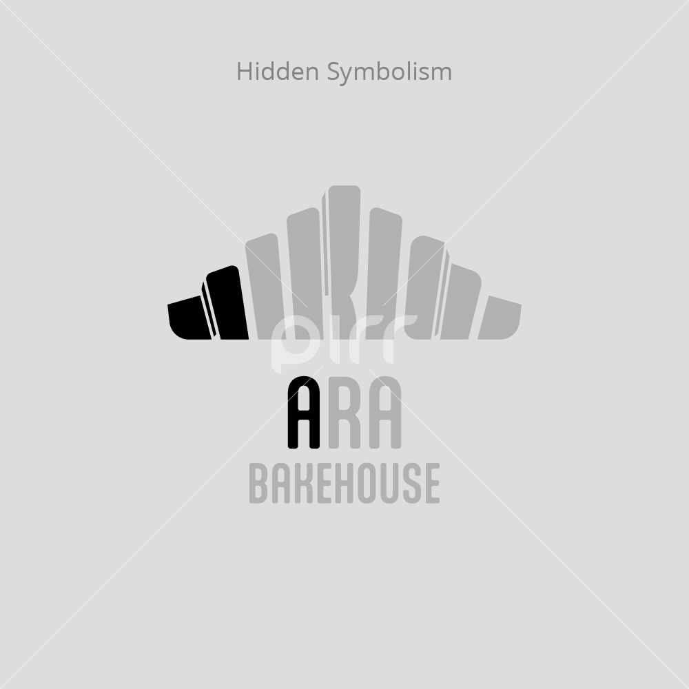
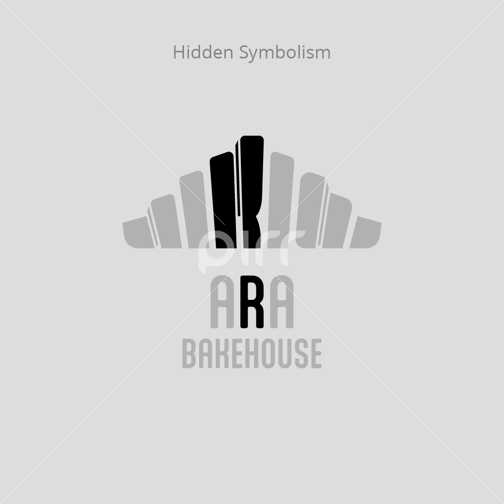
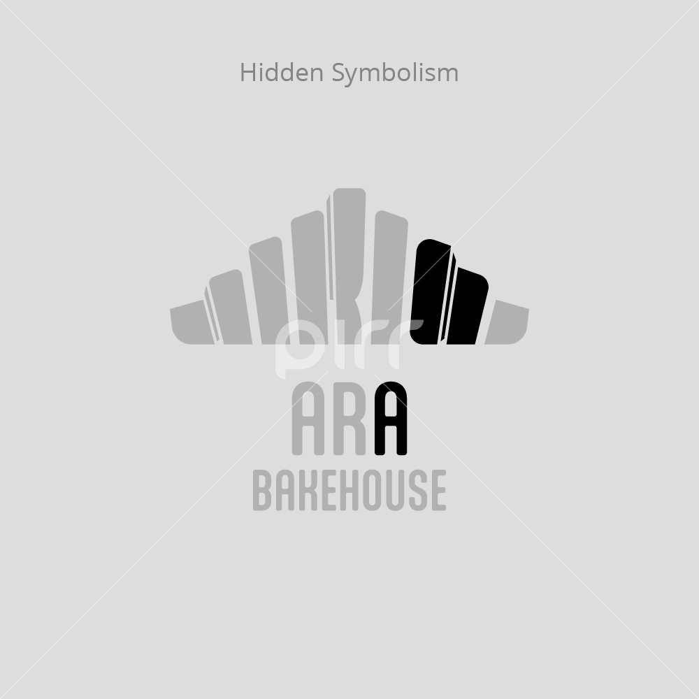
The symbol for ARA Bakehouse subtly suggests a croissant through vertical lines, capturing its unique form and silhouette without disrupting its recognisability. The name “ARA” is cleverly concealed within the symbol, maintaining a clean design. Thin vertical lines mimic the layers of a croissant, discreetly forming the letters “A”, “R”, and “A”. The brand name “ARA Bakehouse” is presented in the same typeface as “Salted Caramel”, establishing visual continuity and suggesting a sister-brand relationship. The proposed logo is adorned in the identical colour as “Salted Caramel”.


