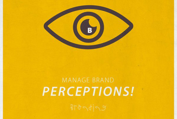
While designers are concerned about the various colour modes in graphic design, brand stewards are looking for ways to use colours to reinforce their brand. Colour is one of the key elements when creating a brand. We have business owners or brand stewards that come to us, telling us to avoid using their brand colours in their marketing collaterals because they are tired of looking at the same colours over and over again. We understand what they are going through but as visual communicators we know that may not benefit their brand. Knowing the importance and impact colour brings to your brand is critical in creating a strong and cohesive brand identity. Colour brings emotions and feelings that are subjective to an individual based on culture, personal experience, religion, gender, etc. Colour plays an important role in visual communication. We use colours on text and images to reinforce desired connotations. How and why are colours important in branding?
1. Colours Encourage Brand Consistency
A brand identity can comprise of the logo, corporate stationery, marketing collaterals, packaging, uniform, livery, etc. Every communication device or symbol a corporate uses, add up to form the brand identity. In fact, colours are part of a brand’s identity. Consistency is the most important element to establishing a strong brand. Brand consistency can be attained through visual consistency, which is defined by the brand identity created by branding agencies or graphic designers. In graphic design, visual consistency can be achieved by the appropriate use of forms & shapes, patterns & lines, design & illustration styles, fonts, imageries, textures, etc. Employing colours is the easiest and most feasible way to ensure visual consistency across the different communication mediums. Defining brand colours encourage brand consistency which builds consumer trust.
2. Colours Bring Desired Associations to the Brand
Colours do not have meanings by themselves. Rather, people associate meanings to colours through what they perceive in their daily lives. People learn or are taught the meaning of colours through what they see. The stationary red man on the pedestrian light tells us not to cross the road – danger lurks. The walking green man on the pedestrian light signals us to cross the road – it is safe. We associate ‘danger’ to the colour red and ‘safe’ to the colour green. Colour associations are subjective and they are influenced by culture, personal experience, religion, gender, geographical location, etc. It is therefore, important for brand stewards to know their target audience in order to use colours strategically to draw desired associations to the brand.
3. Colours Define the Brand’s Visual Territory
In the world of brands, brand stewards are always looking for opportunities of colours. Given a choice, stewards would not use the same brand colours that their competitors are using. Having the same brand colours as your competitors can cause confusion to your audience. If you are a trailblazer company in your trade, congratulations! You’ve got the entire colour palette to choose from. Once you’ve identified your brand colours, use them consistently to form a strong brand identity. And when you’ve used them enough, you literally get to own the colours. Whenever a consumer comes across your marketing collateral clad in your brand colours, they will relate it to your brand. Colours define your brand’s visual territory. They put the audience in a familiar environment where they consume your marketing messages.
What brand colours do you own? How have you been using them to strengthen your brand?